


How to combine colours? Create a unique interior!
Designing your own four walls is an extremely absorbing process. It requires time, a clear vision, and the ability to combine colours! Colours? Yes, colours! Because it is they that play the first fiddle in interior design! Which shades are worth choosing? Which are the most fashionable? What to combine them with? We give you tips!


Combining colours in rooms – what you need to know?
What is the selection of accessories, which can be changed at any time, compared to the decision regarding the colours of walls, tiles, furniture, or floors?! The first thing we should consider is the style in which we want to decorate the interior! Because each trend has its own rules and… colours!
Why is this so important? After familiarizing yourself with the characteristic elements of different styles, it will be much easier for us to make the final decision! We will realize which ones match our tastes, needs, and possibilities! Take a look at the cheat sheet I've prepared!
Interior in glamour style
An apartment arranged in this style is extremely feminine and elegant. Crystal chandeliers, huge mirrors, velvet chairs are its inseparable elements. How to combine colours in a glamour apartment? Although delicate colours like powder pink, beige, light grey reign on the walls and floors, gold accessories must not be missing in the apartment! Boxes, photo frames, pot covers – there's really a lot to choose from!
Interior in Scandinavian style
Simplicity, comfort, minimalism – that's how you can describe the Scandinavian style in three words! An arrangement maintained in this tone is primarily about light colours! White naturally leads the way, but grey is close on its heels!
Interior in vintage style
There are a lot of antiques, things with soul, mementos from bygone years. How to combine colours in rooms maintained in vintage style? This trend is the opposite of cool, muted colours. Particularly desired are all kinds of shades of pink, green, red, yellow, and blue.
Interior in loft style
How to combine colours in interiors designed in industrial style? Loft is primarily about cool, muted colours. Broken white, concrete grey shades, and of course, black! Does it sound cold and soulless?! To break its austerity, it is worth opting for bottle green, brown, burgundy, or attention – a brick wall.
Interior in boho style
Nonchalance, lightness, freedom – if these slogans resonate with you, an interior in boho style will surely appeal to you. It is distinguished by a wide range of colours – the most popular are earth tones – beiges, yellows, greens, browns.
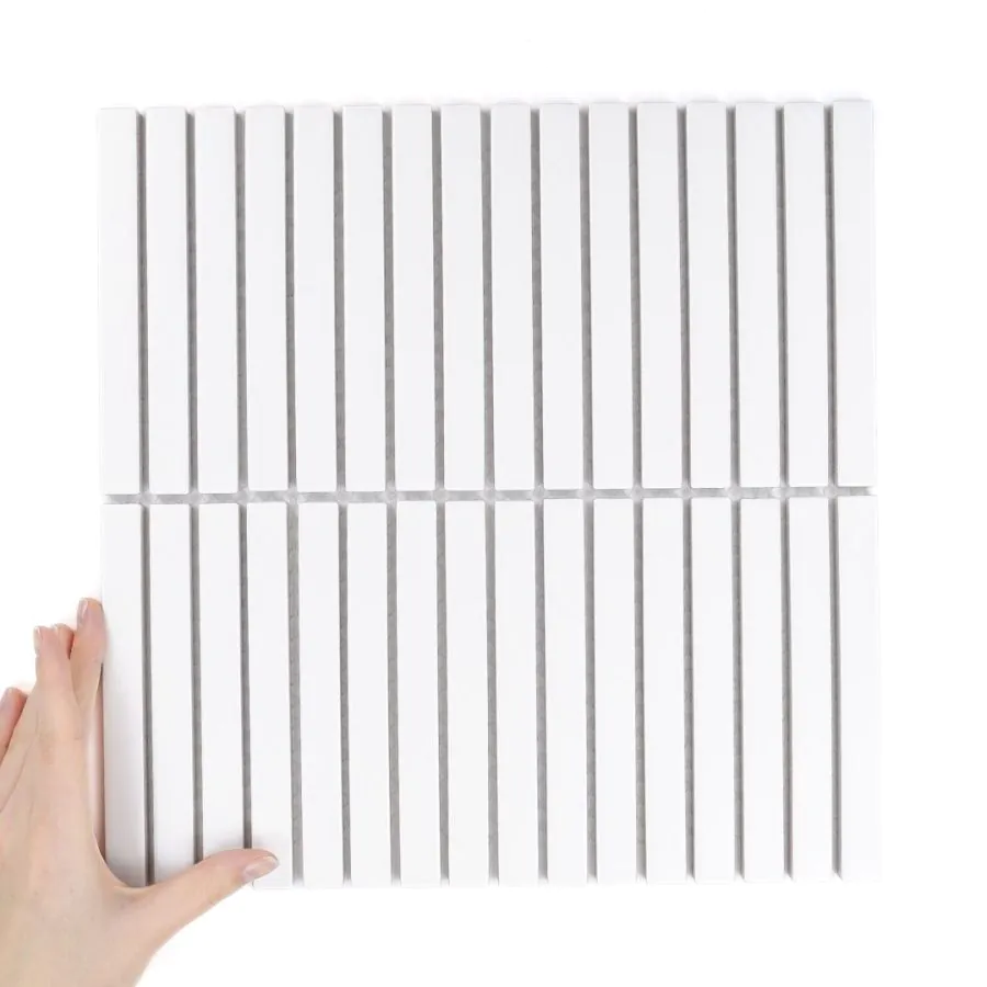
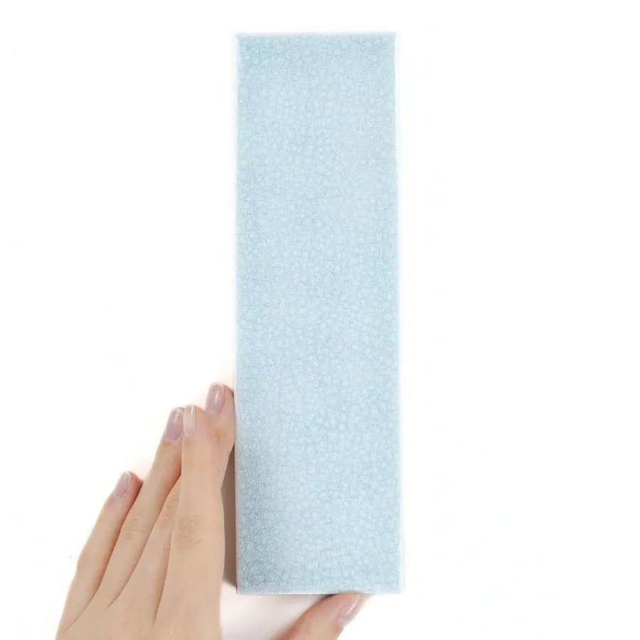
Suggested products


How to combine colours in an apartment? The base is key!
Before we move on to the practical part, which is combining and mixing colours, let's think about the primary colour scheme, the so-called base. What should guide us when choosing it? Style is important, but not the most important! It's also worth considering personal preferences, paying attention to the size of the room, its layout and lighting, and its intended use! Important! In the case of a children's room, we can allow ourselves a bit of craziness.
Colours such as: white, beige, or grey will be perfect for this role. They are neutral, they go well with most colours from the palette. What's more! They fit practically any style – from Scandinavian, through glamour, to loft or vintage!
They facilitate rest, improve mood. They will work well in both smaller and larger rooms. They do not overwhelm, on the contrary – they optically enlarge. They are an excellent starting point for further interior design activities!


How to combine colours? Expert's statement!
A woman will say: powder, salmon, nude. A man? Pink! Combining colours can be problematic already at the communication stage – it results from the experience of architects. It's scary to think what will happen next! The following tips will not only protect you from design mishaps, but who knows – maybe they will even save a relationship?
How to combine colours without an overwhelming effect? I have two suggestions. The first is the 60-30-10 rule, which, simply put, is the percentage share of individual shades in the interior. 60% is the base colour – it usually covers the walls, 30% is the secondary colour – its purpose is to bring out natural depth. The remaining 10% belongs to the accent colour, which is a kind of dot over the 'i'. As a rule, it appears in the form of decorations.
The second is the colour wheel – a tool used by architects. You can use it in three ways. Monochromatic combinations – the same colour, but different shades. Related combinations – include colours located on the same line. Complementary combinations – are based on the rule of opposites. This can be, for example, a combination of green and purple.
How to combine colours? Do it with Raw Decor!
Now that we've familiarized ourselves with the rules of combining colours, it's time for practice. Here are ready-made suggestions inspired by this year's and upcoming trends!
Idea for white
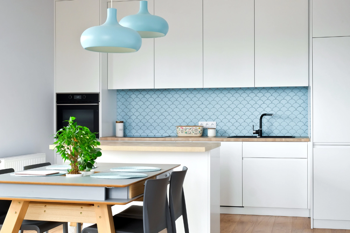
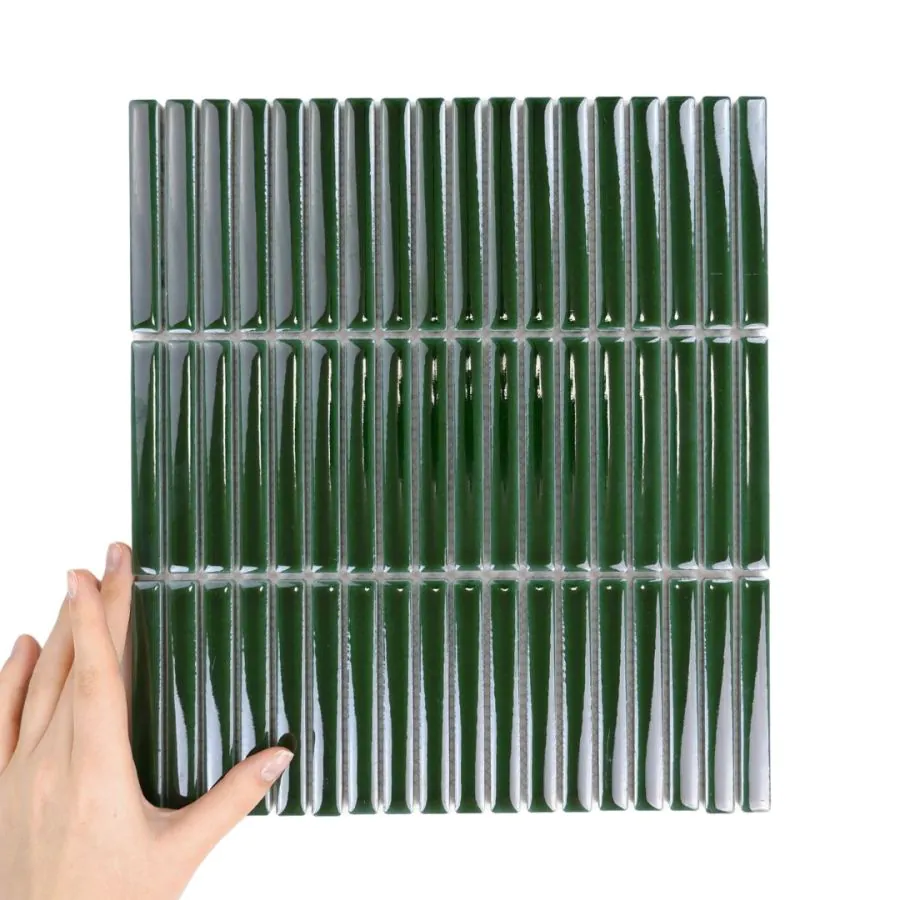
White lovers will be delighted by the fact that top architects cannot imagine interior arrangements without it! However, to prevent it from being boring and dull, it's worth combining it with another colour – even with delicate blue, thus achieving a Scandinavian-style interior. More daring individuals can opt for contrasts – combining it with bottle green, gold, pink, or burgundy elements.
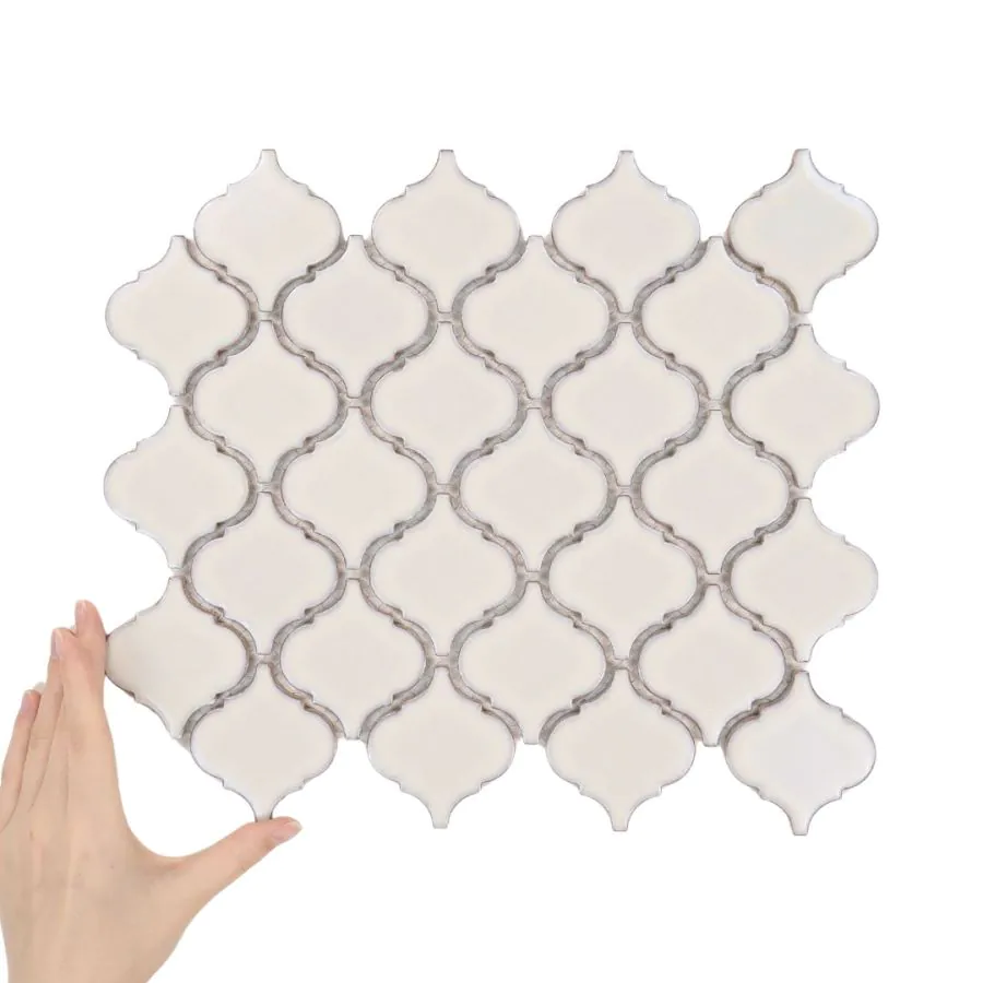
Importantly, white is an ideal background on which to place a mosaic! Minimalist Hexagons, Oriental Arabesque, Holographic Metropolis – this is just a small part from which we can freely choose and compose original combinations!
Grey in combination with other colours
Grey is as neutral as white and easy to combine with other colours. It's worth breaking it up with pastel accents – powder pink, delicate peach. The loft style will be an exception, where monochrome is preferred.
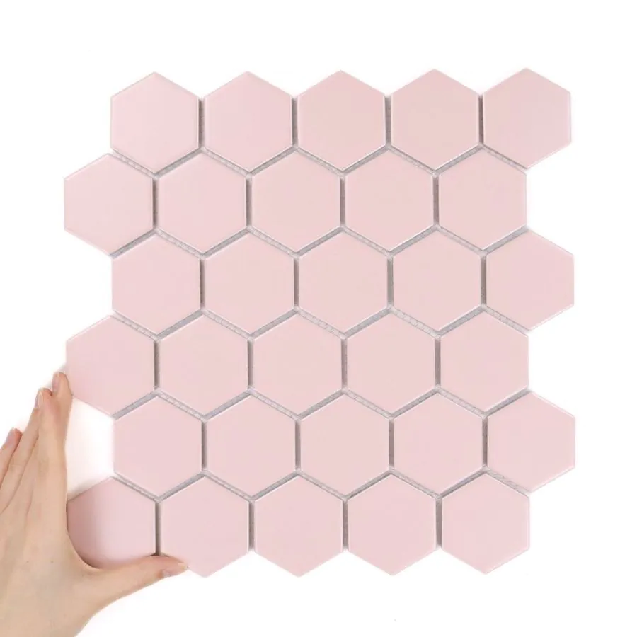
Light grey walls and small Pistachio Hexagons? Sounds original? And that's how it looks! This is an excellent suggestion for people who value unconventional interior design! It looks fresh and light, and it calms the eyes. It brings nature and spring to mind. It will look great in the kitchen, but also in the bathroom.
Beige in an elegant version
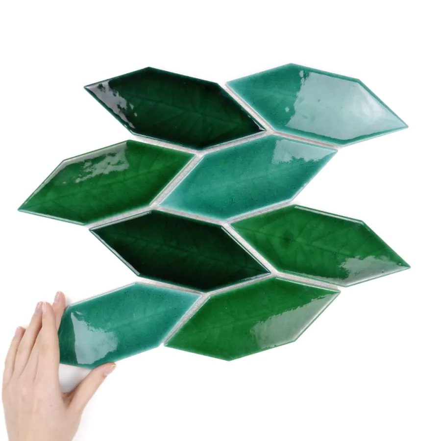
The colour beige is a recipe for an elegant and subdued space. It complements colours in the same tone perfectly – white, greys, brown, ecru. However, it will also form a successful duo with contrasts – black, navy blue, blue, bottle green!
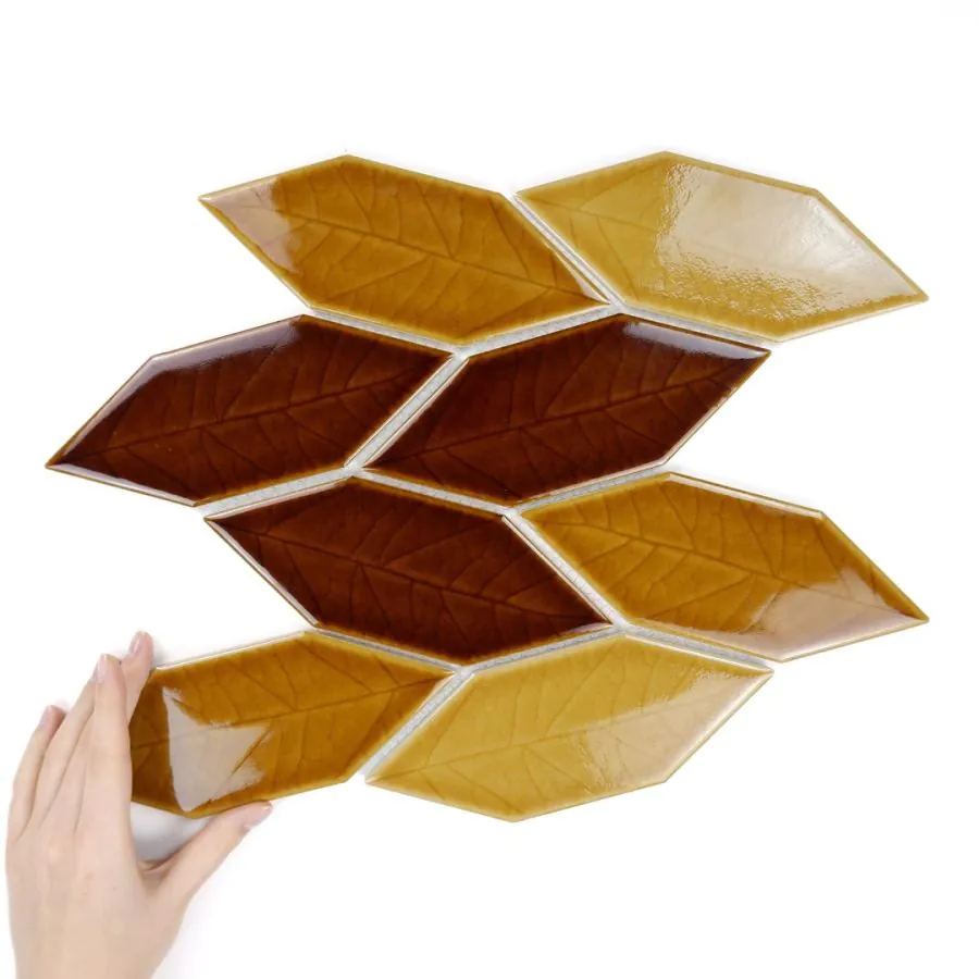
The Autumn Leaves Gloss tile against a beige wall, combined with gold accessories, will look extremely tasteful – especially in an interior maintained in the glamour style! It will give it a unique, yet extremely warm atmosphere!
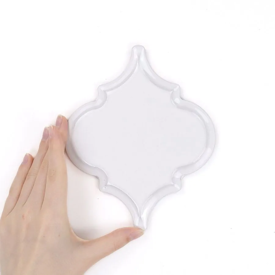
Suggested products
How to combine colours in interiors? Summary
How to combine colours in interiors? The answer is a bit more complicated than it might seem. The starting point should be your own taste and the style in which you plan to decorate the interior!
If you have some time, it is worth searching the internet for photos of finished arrangements – on our Instagram there are plenty of them! This method will work particularly well for visual learners – people who learn fastest by imitation.
Don't worry! There's something for busy people too! We're talking about ready-made colour duets! Combinations that don't need introducing to anyone. They are well-known, proven, and widely used! Grey and blue, black and white, creamy beige and ecru!